Project Overview
The Marketing and Communications team at Suffolk University submitted the University website to a higher ed market research group at Stamats Communications. The team was seeking insight as to how to improve their academic pages for prospective students. Upon reviewing the findings, the team decided to bring me on to help address the issues that were uncovered.
We arrived at two main objectives:
- 1) Modernize the visual design to improve the usability of the website and its navigation to lead prospective students to the next steps in the enrollment process.
- 2) Include consistent, well-organized information so that prospective students can gather the necessary information as they go through their decision making process.
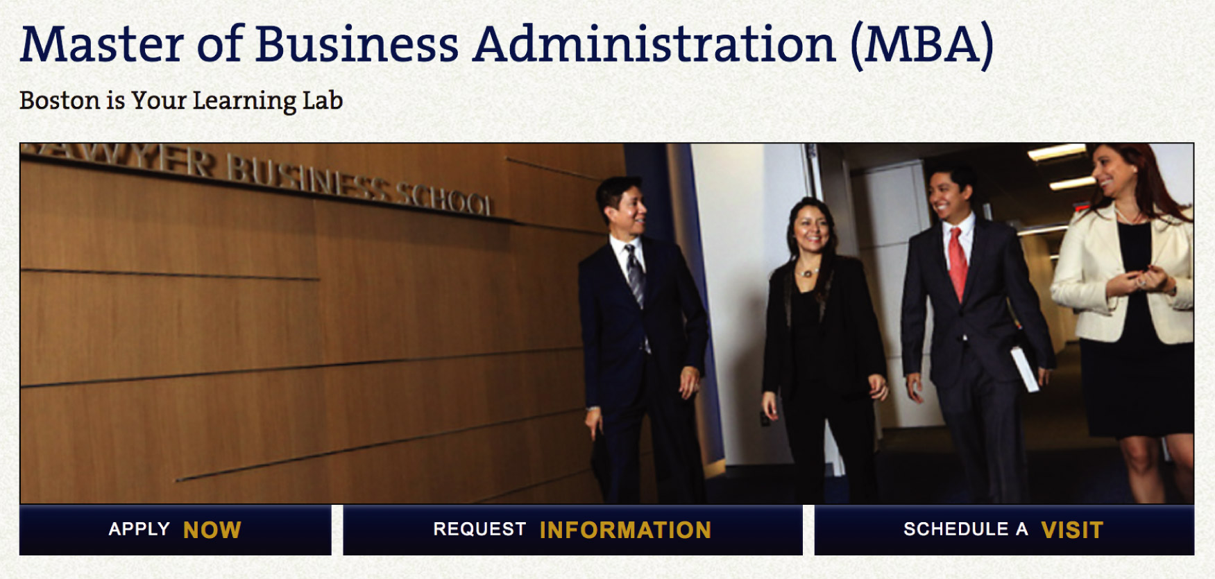
Previous design

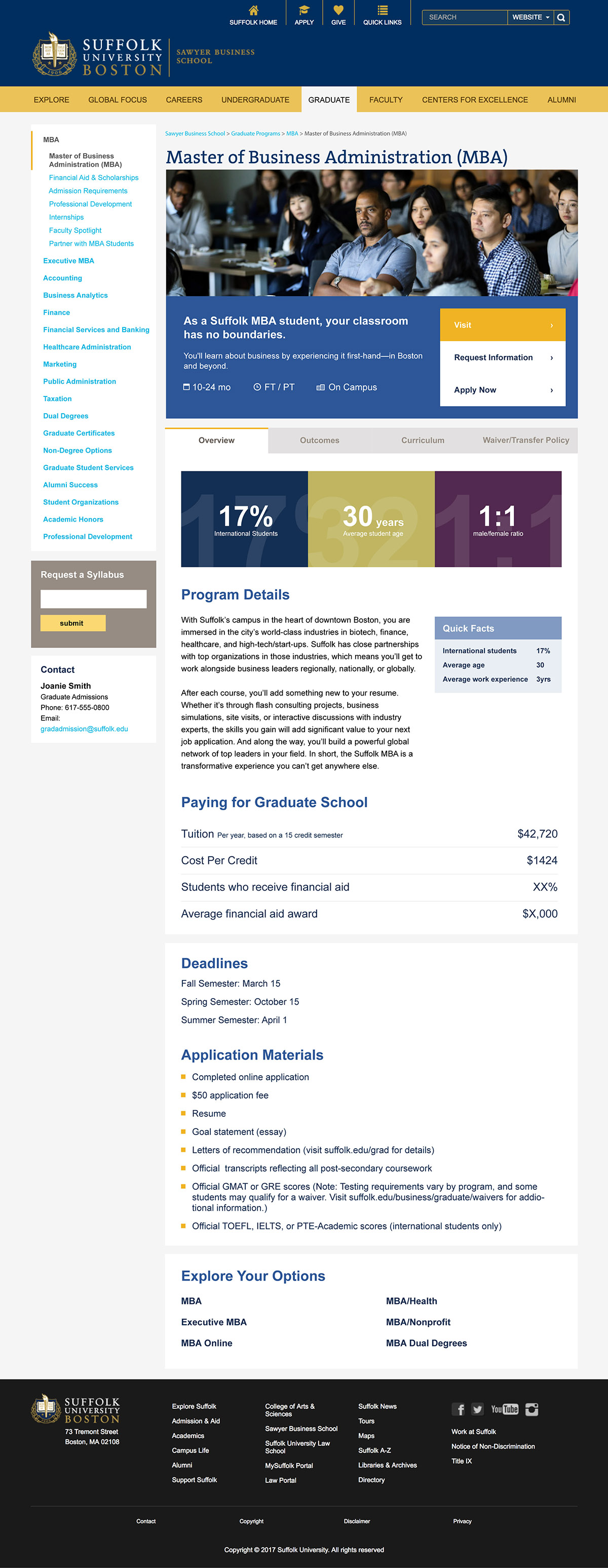
Proposed design

Challenge
The results from the Stamats evaluation revealed that the website lacked clarity in navigation, organization and completeness of information. No major architecture overhauls of the existing site were to be made, which meant the general structure of the site must remain as is.
The academic pages needed to supply users with information that would enable them to make the decision to "Visit" or "Apply", the main CTAs. How do we encourage users to take the next steps?
Process
First, I identified the key design issues that a revamp would have to solve.
Issues with previous design:
- Unclear CTA
- Illegible content
- Disorganized and incomplete information
- Left nav obscured by design
- Dated styles for nav, background, borders, etc.
Proposed design and solutions:
- Clear CTAs (Visit & Apply)
- Minimal text styles
- Consolidated program listing
- Restructured content
- Concise left nav
- Active state on main nav
- Visual design improvement
Navigation
I looked at our Google analytics to help identify areas for improvement.
First, I addressed the placement and visual design of the CTAs. The goal is to encourage users to go to the "Visit" and "Apply" pages so that they can progress through the enrollment process. The CTAs underneath the image were previously underutilized at under 1% of user interactions. The solution on the right improves the legibility and makes it clear what the next step is beyond visiting this page.


The left navigation was also wildly underutilized. In order for the left nav to be usable, it needed to be more concise and legible. One of the iusses that several department heads brought to my attention was that the left nav was too long; access to their programs were hidden down the page. I made recommendations on how to consolidate the pages and I redesigned the visual aesthetic so that users can better understand where they are in the page hierarchy.


Another important part of the navigation that needed some love and attention was the main nav. The previous design was, yes, outdated, but it also lacked clarity in indicating where the user was on the site. On a website with tens of thousands of pages, users (even users from the staff) often got lost on the website. This minor but effective change was vital.


Organization
The Stamats results indicated that the program pages lacked certain key information. I researched other university websites, carried out expert reviews and found that Suffolk's program pages lacked information that prospective students need in their decision making, such as tuition, program length, class statistics, deadlines, application materials, outcomes; the list goes on.
After extensive research to track down content for a standard set of information for each program, the data that the team acquired was still quite fragmented and sometimes incomplete. This posed a design challenge of presenting varying amounts of information for different programs.
Because there were so many different types of information to display, I chose to use tabs to organize the data so that there would be a consistent structure between all programs.


Results
The restructuring of both the navigation and the page content vastly improved the next page path for our users.
The analytics indicated a 3x increase of users who go directly from the academic pages to the "Visit" and "Apply" pages. This tells us that the redesign of the CTAs and navigation was successful.
The new design also encouraged users to stay on the page 150% longer. This is attributed to the fact that there is now more information that is organized in a useful way.